Providing a broad range of vital social services, Sonoma, California-based Hanna Center is using a comprehensive brand update to evolve longstanding perceptions, underscore its unique value and relevance, and forge a new, passionately shared sense of focus and purpose.
Sector
Environmental, Social & Governmental
Brand Challenges
- Create the perception of a more youthful and dynamic organization
- Focus and amplify value propositions
- Organize and clearly differentiate services
- Create the basis for stronger community connections
- Overcome dated and sometimes negative perceptions.
Story Tools
- Brand Platform & Personality
- Brand Backstory & Messaging
- Visual Identity Development & Logo Refinement
- Information Design
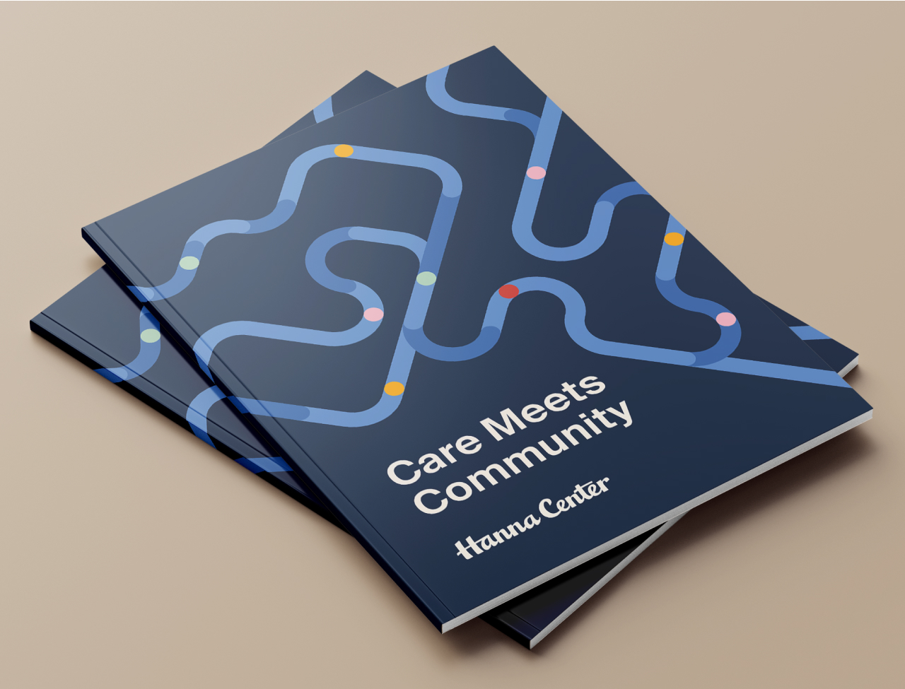
- Annual Report Concepting & Copywriting
- Web Copy
- Ongoing Support

At issue
Founded in 1947 as a Catholic charity operating an academy and residency for boys, in recent years Hanna Center has diversified its offering and clientele while also moving to a more secular focus. As Hanna looks to the future, its leadership realized the need for a bold vision, a compelling story and a more dynamic, welcoming and high-profile presence to foster stronger ties with the community, build national awareness for its specialized training curricula, drive home its impact, and appeal to a new generation of funders.

Never Settle for the Status Quo
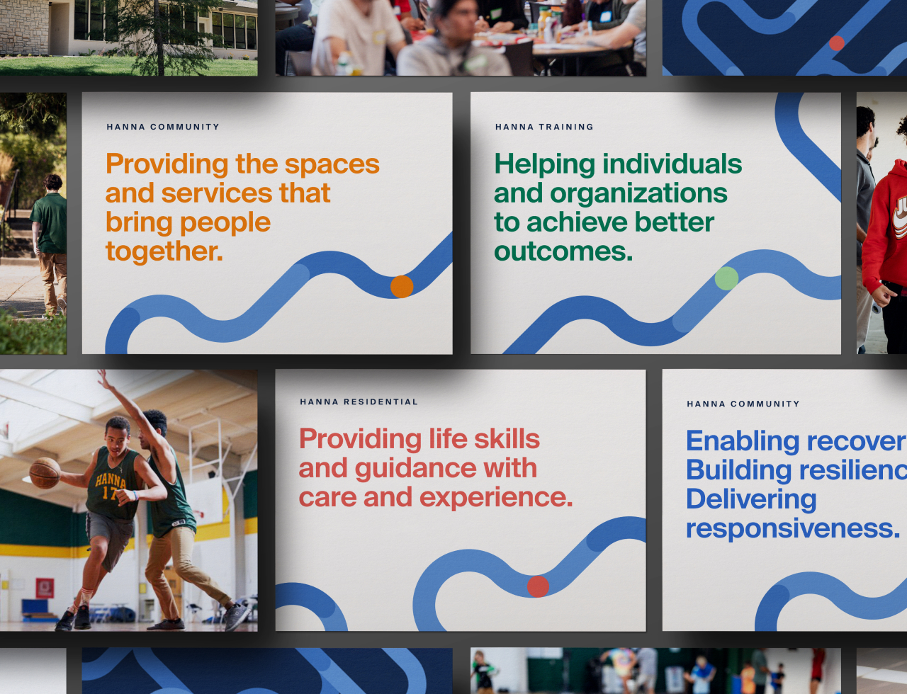
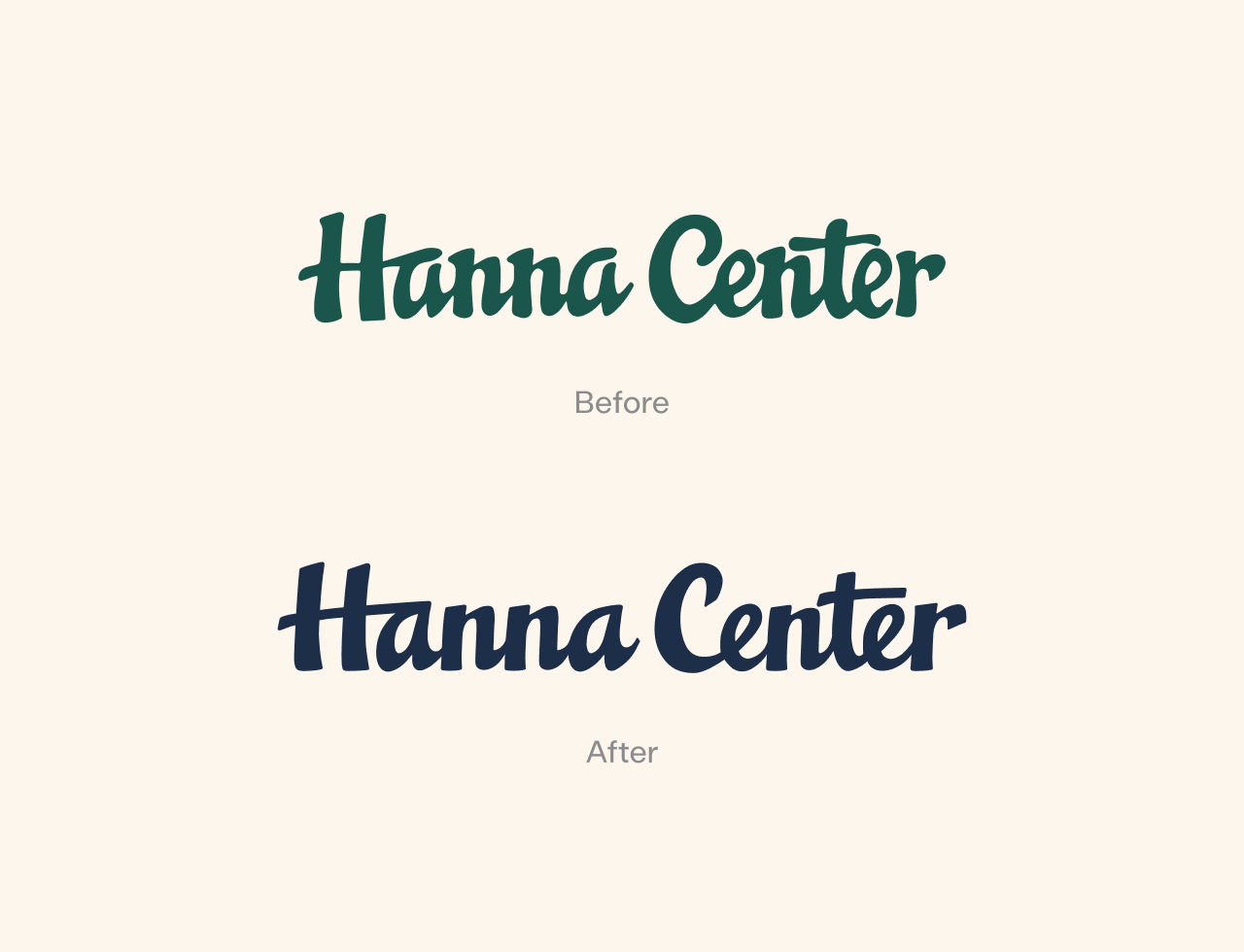
Guided by the CEO’s vision of transformative care, our discovery effort led us to confirm Hanna’s breadth of services, many recently added, as a powerful differentiator—followed closely by its deep commitment to research and results. After establishing Hanna’s overall positioning and promise, we worked with stakeholders to represent its offerings in across four broad, commonsense service areas: mental health services, training services, residential services and community support. From there, we developed a backstory that brought Hanna to life as a dynamic, relentlessly standard-setting organization through the care it delivers as well as its continually expanding scale and reach, sustainable momentum and growth, and expanding network of respected collaborators and partners. Visually, this dynamism came to life in a bold, energetic identity that alluded to connections and movement. For good measure, we refined Hanna’s hand-drawn logo to give it a more polished presence while remaining familiar to community members who have come to identify with it over the course of decades.

Deliverables & Outcomes
Story tools included a brand communications platform and backstory, multi-audience messaging framework, refined logo and new visual system, the last of which we developed in tandem with our network partner Ajust Design.
After concepting and writing key sections of the organization’s new annual report, we turned to supporting development of a completely reimagined web site spearheaded by Ajust Design. The annual report has won accolades from board members and community partners. Staff have responded with enthusiasm to the new identity, which is currently being applied to the new website and additional touchpoints.
Longer term, Hanna has engaged Applied Storytelling to help guide strategic rollout of the new brand story and identity on an ongoing basis.

